Wednesday, December 16, 2009

final illustration portfolio


world record illustration- total time: 12 hours


cheesy illustration- total time: 10 hours


sound illustration- total time: 10 hours


product illustration- total time: 6 hours
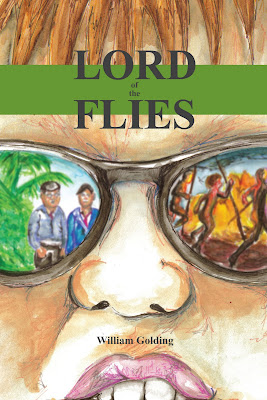


book cover- total time: 8 hours


missouri postcard illustration- total time: 4 hours


3 image gouache montage- total time: 10 hours
dmv cartoon-total time: 7 hours
a lot of my thoughts about my projects are already stated earlier in my blog so i thought i would just offer my final thoughts about the semester in this portfolio. the roughest project was the 3 image gouache montage because we had to re-do it. i thought that i spent a lot time on the original but the second version turned out a lot better. the bundt cake gave me real trouble but it looked a lot better when i re-did it. the texture on the sock monkey looks a lot better too. i really like the world record illustration. i felt like the texture in the water that i created was pretty effective and i liked the splatter effect in the sky for the stars.
overall, im just glad i survived this class. i was really scared to take this class at the beginning of the year and i feel like i've improved over time, even if by the smallest margin. i feel like i hit my stride with the dmv cartoon. it was really fun and my final result was pretty cool. i was really proud of myself on the book cover illustration even if its still not up to par with the rest of the class. i have grown more comfortable with myself over the semester. i was nervous to work with watercolor, and i know that i have more to learn, but it is less daunting to me now. airbrush was also a new media for me, but it was fun. the only thing i hated was trying to find a dang airbrush that worked! and frisket was a little difficult too. overall this class was a good one but i would never want to take it again!


final viscom 2 portfolio


red barn campaign- total time: 20 hours


joe 6-pack- total time: 8 hours


audiobook- total time: 6 hours

native american heritage month poster- total time: 5 hours
rapala ad- total time: 7 hours
times in the woods spread- total time: 5.5 hours


professional photo pieces- total time: 7 hours
i feel like i've expressed all my thoughts about my pieces earlier in my blog and the amount of time i spent on each project is under each project so i thought i would just general thoughts on the semester in this final portfolio. i feel like i have definitely progressed with my skills this year. i was little skakey at the beginning when we did all those re-do posters...but my confidence has grown throughout the semester. my favorite project was joe 6-pack. it allowed for more freedom...although i always love given perameters. joe 6-pack was a little more playful and i like doing 3D projects. they feel more like real jobs because the end result is more tangible than something mounted on foamcore. i think that a lot of my projects would have been better with a bit more time, but that is the way things go. sometimes you might not get the amount of time you think you deserve to finish a project. i think that this class has taught me a little bit about how to role with the punches and get things done even when i didn't think that i could. i know now that i can do it and still turn out some pretty decent work in the process. i'm excited about my future viscom classes. i made it through boot camp!


audio book


this project was made easier by the fact that we had to do an illustration assignment along the same lines as well, so i just used what i made i that class for this assignment. the outside starts with piggy's face and the lenses of his glasses taken out. then when you open the audiobook, you get closer to the glasses and now you see the pictures in two different lenses. one is the boys civilized and the other is the boys as savages. the illustration took me about 5 hours to complete and the design of the audio book took about 2 hours. so not that much time but i think that it is effective none the less. on the cds themselves are the images from the lenses but i overlayed broken glass to demonstrate piggy's broken glasses from the novel. i liked this project a lot.

illustration book cover - lord of the flies


i am so sick of book covers. the finals in all my art classes were some form of book cover. for this one i did a book cover for lord of the flies by william golding. it is one of my favorite books so i thought it would be fun. my idea involves the ever popular glasses. in one lense i put a picture of the civilized boys and in the other i put a picture of them as savages because that is how the book progresses for them. i started with some line work and then put watercolor over it. i think it was pretty effective. i felt a bit more confident working on this one for some reason and it payed off a bit. i feel like it is one of my best illustrations of the year.

sound illustration


i kind of liked this project. it took me like 7 hours to paint the whole thing so i was kind of sick at looking at it. i was pretty pleased with the final product. i think my favorite part is the champagne glass. i feel like i did a pretty effective job of making the stuff behind the glass look right. i was also pretty happy with the flowers, not so much with the green of the flowers, but the petals and stuff. overall, its pretty good compared to some of my work in the past.

joe 6 pack


i think this was my favorite project of the semester. when we heard that we had to use our name in the titles of the drinks i immediately knew that i wanted to use the name rosie somewhere...even though i hate it when people call me that. i wanted to make the design really fun and lighthearted so i put a dancing grandma on the front and decided to put circles all over the place because i feel like it is bubbly and bright. i think each rev took about 2 hours to complete...so not too bad. all in all it took between 8 and 10 hours total. i'm pretty happy with the way the design turned out and i was really happy that the packaging held up in class. it was pretty sturdy. i used bristol board and then i put another layer of paper on the inside to make it hold a bit better.

Friday, December 11, 2009

final red barn


just posted the second rev, but this is the final! i'm so happy this project is over. frankly i'm sick of looking at it and i hate the color red! i kept the same images within the layout, but decide to mess around with some gradient action. i liked the effect it had so i went with it on my layouts. i like how the images fade into the red on the sides of all the pieces. again it took about an hour and a half to revise each one so a kind of hefty amount of time. while not the most original idea in the bunch, i feel like i executed it pretty nicely. i don't know how everyone feels, but whatever. i've learned over the semester that while you should value others opinion take professors advice, sometimes you have to go with what you like, otherwise your work will not be yours anymore. what started out as something you believed in and liked will be morphed into something you don't even recognize. i still do appreciate the opinions of others, even though i do not ask for them very much. that is something i need to work on. yay red barn is finished!

2nd rev of red barn


this was my second rev of the red barn campaign. i got sick of this project really fast. it was difficult to think of something new and fresh for something that is so rooted in tradition and includes stereotypical rural activities. i don't know...i feel like others were able to come up with an idea, but i was not able to. i like what i am doing with this rev a lot better than what i started with. i think each piece takes about an hour and a half to revise, so its taking quite a bit of time out of my day to get these done. this is obviously not my final rev, so changes are coming!

final cheesy illustration


i am sooo happy about how this one turned out. it took me about 10 hours to complete. a lot of that time was spent cutting frisket and re-placing it on the board to fit exactly. it was a pain, but the piece turned out 10x better than i expected, even if its not up to par with what other people turned in. i surpassed what i thought i could do and i'm pretty happy with myself. the one thing i wish i could change, and its minor, is that the yellow on tigger is a little bit dark, but other than that nothing. the hardest part about this project was getting the airbrushes to work correctly. even when i found one that was working great, it would decide to stop being nice and spit paint or just not emit paint at all. it was frustrating, but i think it was worth it in the end. overall, i surpassed my expectations for this project and felt pretty good with myself after completing it.

final conversation illustration


i'm not very happy with myself on this one. i didn't spend near enough time as i should've on it. i liked the project from the beginning and really liked how my comp progressed. i ended up really liking the composition, the final execution was not what it needed to be. i waited til pretty close to the deadline to start and it worked against me. i decided to do the color work in photoshop because it worked out so well on my last cartoon assignment. i probably spent about 3 hours putting color onto the piece which i thought would be enough time but it is nowhere near what i imagined. i really like colors in the piece, they just need to have more depth. i attempted to add some in, but i guess i'm not very confident with the photoshop "airbrush" technique. needless to say, you will not see this in my final portfolio.