Friday, October 30, 2009

pencil comp of world record illustration


here is a tighter pencil comp for the guiness illustration. i changed the angle of the castle and added a bit more detail to the earth to make it read as a globe. it will look a lot better when i add color to the comp because i will be able to make the castle look more like sand and the earth will have more definition.

Wednesday, October 28, 2009

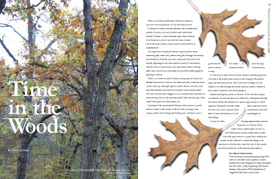
final time in the woods layout


here the final for the time in the woods articles. i added the brownish bar on the right to give a little variety within the text. i think it works out pretty well...except my cob is a little wonky...but it works otherwise. i worked on the headline a bit...tighting up the kerning and letting a small bit. i still love the picture, which is why i like the spread so much...everything else is just an after thought kinda...haha.

Monday, October 26, 2009

final professional photo pieces


here are the three final versions for the pieces using the professional photo. my favorite one is the ad, but i think they all turned out pretty well. i would say that i am definitely improving, not at my peak level, but i'm happy. i'm feeling a bit more confident in the things i do. of course i will probably be brought back down to my level very soon :)

revision of time in the woods spread


i completely revised this spread because the first one looked like a hunting ad. i went out and took some more pictures with trees that have more colors. i didn't really want to ruin the photo by putting all the text over it so its just along the top. overall i think its a lot better than my first one.

Friday, October 23, 2009

guinness world record illustration


our task with this project is to create an illustration based on a specific world record. i chose the worlds tallest sandcastle because its really cool. it stands 49 feet tall. here are the initial sketches.

illustration update--conversation illustration


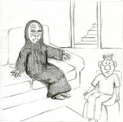
i haven't blogged in a while, so here is all my illustration work for the past couple weeks i guess. we are working on our conversation illustration, which is a piece based on a conversation we overheard. the conversation i eavesdropped on was about someone wanting to be death eater from harry potter for halloween. we had to make ten sketches depicting the idea in different ways, then we did a pencil comp, then several revised marker comps. the idea of mine that was chosen shows the "death eater" sitting awkwardly in a room with someone else. i really wanted to make the other guy nervous looking to show just how awkward the situation is. i did the marker comp and it felt a bit disconnected so it was suggested that i just focus on the facial expressions. now my only task is to move the "death eaters" hand to the shoulder of the guy. so here all the stuff is. overall, i'm enjoying this project a lot.

Wednesday, October 14, 2009

initial time in the woods spread


meh...not very impressed with this one. when i took the pictures it was pretty cloudy so i'm going back out soon to try again. another idea came to me in class today so i might try that. i actually like the picture on the left side, it just needs a bit more color and might work better smaller somewhere else in the layout. i shall try again on this one and see what happens.

final 3 image gouache montage


here it is...the final gouache montage. i'm pretty happy with the final result. i tried to get it as close to my marker comp as possible and i feel like i was pretty successful. i guess if i could change one thing it would be some of the coloring on the bundt cake, but it turned out well anyways. i think we just need to do cartoons the rest of the semester because i hate gouache!

its time for a re-do. we were told in class today that we needed to do these again. geez i'm so sick of looking at this thing. i guess i'm happy i get another chance, but its not going to be fun. i really want to do the bundt cake over and maybe try something different with the sock monkey texture. i don't know...we'll see.

*midterm portfolio* --illustration

oh illustration...my best friend :) actually illustration doesn't like me very much so i tried to choose my best works of the semester. we'll see how it turns out.

#1


this is one of the first watercolors we did. its still not where it could be but its a lot better than previous ones. i'm a complete control freak so watercolor is not my friend. i chose this watercolor in particular because i tried to be less exact with the lines i made. i tried to let me hand loosely place the colors on the page. some parts work and others don't. it probably took me about an hour to finish this one. while not the greatest thing ever, its pretty good for me.


#2


this is an illustration we did of architecture. i chose this one because i like the look of it and again it demonstrates me going outside of my comfort zone and trying to be a little more gestural with my watercolor work. i could have added a bit more detail but i have learned the more i work on something and just add and add and add detail, the worse it gets. it just gets muddy. so i thought this was a semi-good balance of detail and gestural work. i just really like this one a lot.

#3


this assignment was our product illustration. we had to try and make it look as realistic as possible. i chose a mountain dew can because it is my favorite drink. i chose the older version of the can because the newer design is just plain ugly. i think it turned out pretty well. i started with the mountain dew logo first because i felt i could mess that up the most. i wish it was a bit tighter. i should have gone back and carefully outlined the letters and then gone over the white a bit more. the green part of the can and the "swirls" were pretty easy...pretty gestural. i actually think that the most successful part is the top of the can. i felt i did a good job of imitating the shiny metal on top. i hate the background...but overall i thought i did a fine job.

#4


this is my favorite project of the semester and probably the most successful for me. it was because i didn't have to use watercolor or gouache! we were asked to create a "gag" relating to something within the dmv. for me the worst part of the dmv is getting your picture taken so i thought i would do something with that. i like my laughing guy the best. i think he really makes the whole cartoon. we started with line work and then scanned the piece into the computer, then added color using photoshop. i liked doing that it was really fun and i had never done it before so i learned something new! i really liked doing this project because i had a bit more control over the piece. i'm really happy with this one.

#5


this is our most recent project, the 3 image gouache montage. we were told to pick 3 unrelated objects and put them into one cohesive composition. i chose a sock monkey, a bundt cake, and cork screw. i feel like its pretty successful. it looks almost identical to my marker comp so i was happy about that. i should have spent a bit more time on it, but i felt like if i messed with it anymore it would totally be destroyed. i think i like the cork screw the best. it has the most realistic feel and pops off the background. i would probably change some of the coloring on the bundt cake, but it was pretty successful as well. i'm still not as comfortable with gouache as i would like to be. i need to practice more!

*midterm portfolio* --vis com 2

so i completely forgot about this until today and did no revisions on my layouts, so at the end of each little section i will attempt to tell you what i might change if i were to edit these in any way. its kind of the lazy way to do it, but i think it works just as well. it also shows how i've progressed through the semester more clearly.

#1

the first piece i chose was one of very first posters we revised. it is for the kirksville art association art classes. it is an 8.5 x 11 black and white poster, no bleed. i think it took me about an hour and a half to complete the whole thing. i chose this one because it was the first time where i started to understand the whole idea of a concept. while the poster could use a lot of tweaking, it gets the message across. if i were to change anything it would be the graphic. i like the idea of the clay kind of falling down to create the coil pot, but it could be done in a cleaner, more attractive way. i think i might also change the size of the type because it is much too large on the page.

#2

this second piece is a re-do of a poster for the truman state rock climbing club. this one is 11 x 17, black and white, no bleed. it took me about 2 1/2 hours to finish. i chose it because i liked the concept behind it. i tried out something new with the watercolor mountains in the top. they were semi-successful. i need to go back in and add some highlights and shadows to make them more mountain-like. i also need to remove the things at the end of the paint "drips." i was trying to add some tools of mountain climbing, but the placement of them and the mixture of the vector work and the watercolor wasn't really effective. after removing those the type will also have to be done. i know it needs a lot of revision, but i think this piece demonstrates how willing i am to try new things because sticking to the old stuff isn't always a good thing.
#3

this is another poster re-do...this time for native american heritage month events. it is 11 x 17, black and one other color, no bleed. it probably took me at least 3 hours to complete this one. when i first did this poster, there was no concept at all, so i added the quote and went along with that. i don't feel like there has to be this massive eye catching clever headline on every poster...so i think the quote works. i would need to fix the direction of the drop shadow behind the text and probably make all the yellow bars a bit thinner. they are too heavy. overall, i think the simplicity of the poster works and keeps the viewer focused where they need to be focused. i like the big picture, i think that works well enough in drawing attention to the poster and i actually didn't mind the yellow-orange color. i kind of like it :)

#4

this is a magazine layout without very minimal text. the final size is 10 x 14, full color, full bleed. in the end, i probably spent 2 hours on each side. i chose this layout because i really like the left side. i think that compared to what i started out with its a vast improvement. my original idea was to use a fair amount of food c.o.b.s but a lot them looked kinda bad so i was told to focus just on the question mark. i think the integration between that and the headline works out quite nicely. the right side of the layout needs a bit of work with the body copy as well as the fresh concerns type. i like the picture on the right side that i ended up with, but something else needs to happen with it. while not the most awesome layout ever produced, i think it works out pretty well.

#5

yay for rapala! this is a magazine ad...11 x 17, full color, full bleed. this was a rough one to design. for one it was hard to think about it in terms of an ad because of the large text block. this took about 3 hours to finish. i started with something completely different and glad i changed it. again i think the right side of the page is working pretty well. i need to make the fishing lure on the bottom quite a bit smaller, but i like what i did with the headline. i think splitting it into two parts, separated by the beginning part of the text really gives it some good visual weight. i also like the top of the page with the sequence of the three photos. the right side could use some work. the rapala logo needs to be smaller (sidenote: i rebuilt it and am quite happy with how it turned out :)) and then i could adjust the letting on the text to give it some air. also, the fishing lure on the top needs to be either moved or removed completely. i think the drastic change between this layout and my initial one is pretty awesome. i am pretty pleased with this one overall.
#6

here is another magazine ad. it is 11 x 17, full color, full bleed. even though we aren't technically done with the project yet...i like how this one is turning out. for the start of the this project, we had to choose a professional photograph that we thought was a good one. we had to use it in 3 different layouts and out of the three i think this one is working best for me. i like the addition of the family...my initial layout did not include them. i think it makes the purpose of the ad more apparent and effective. i think that i'm trying new things...by that i mean something i've never done before. i'm a creature of habit and therefore, stick to things that work. but i'm trying to change and i am completely open to trying new things. i still need to work on getting the logo for the company more apparent. other than that i think this one is on the right track.

overall, the semester has been going ok. it has been a lot of work, but i think it is starting to pay off for me. i need to spend a bit more time working on each project, but i think the things i'm producing now are far superior to the stuff i was doing in the beginning. i hope i can keep the progress going in the right direction. i've learned a lot so far this semester. i've learned that the grid is my best friend. at the start of the semester, i only kind of used the grid...it was something there if i only absolutely out of ideas. now i know that it will guide me in the right direction almost every time. i've also learned a lot about type...how to lay it out and all the rules that go along with that. i haven't mastered all of them yet, but i'm still working at it. hoping for an even more successful second part of the semester.

Sunday, October 11, 2009

revised professional photo layouts


so with in the layout for the ad, i added a cut out of a family on vacation to emphasize what the ad was actually for. i also changed the coloring of the some of the text in the headline to add emphasis as well. i like this one better than the initial. with the poster i needed more of a concept so i put a quote above the picture instead of saying study abroad. i also added a little silhouette of italy to the bottom to jazz it up a bit. not sure how much i like this one, but i think with some tweaking it could get there. in the magazine layout i cut the picture off so it didn't go over the gutter and made the columns of text on the right page a bit bigger, moving from a five column grid to a six column grid. there was a lot of text so i decided to break it up with a picture because there wasn't really a quote i could pull out and use. the article is about free things to do in when rome when on vacation so i thought a statue would suit that idea nicely. i think its pretty effective. other than that i just added a bit more space between the picture and the text underneath it. this is my favorite layout of the three so far. we'll see what happens with the next revision.

Friday, October 9, 2009

3 image gouache montage marker comp


we had to do a marker comp to work out all the color decisions for our 3 image gouache montage. i haven't done many marker comps so i thought this one was pretty successful. since bundt cake is typically brown and the sock monkey is usually a blueish grey color, i decided to use orange in the background as a compliment to those colors. i'm really nervous about doing the actual gouache work. its not my strongest suit. can't we do another cartoon!? i'm planning on spending more time on this then any other thing we've worked on so i'm hoping it will turn out well especially with the marker comp there as an aid.

final rapala


here it is...the final of rapala! i completely changed my design but it was just plain horrible. i think this one was a bit more successful. one thing i was having trouble with was the headline so i just decided to simplify a bit. i divided the headline with the two black lines and the block of text. i think it works out pretty well. it was mentioned that the ad should show the result of the product so in this case pictures of people holding up the fish they have caught. i put three on the page to emphasize the effectiveness of this particular product. meh overall i like this layout way more than my initial idea. glad this ones done.

Thursday, October 8, 2009

advanced digital graphics update


here are the three large projects we have completed for advanced digital graphics so far. the other things in the class are just to practice the techniques we learn on a particular day. the first is a typographic alphabet with a sports theme. the second is a stamp series relating to something within visual communications so i did typography and different ways it could be created. the third is a collage based on a word that we used to describe ourselves. i chose the word moody and took it to mean someone who is happy one minute and sad the next. the collage is very reliant on the contrast between the light and dark objects.

life note: i've been a little out of focus the past couple of weeks but i feel like that is turning around. a few incidents that i'm not really proud of (but don't regret) have made me rethink some things. hoping things get a bit better for my group of friends and extremely better for me.

Wednesday, October 7, 2009

initial layouts with professional photo


recently we were given the challenge to find a professional photo that we thought was really well done. we weren't told initially what it was for but now we know. we had to create three different layouts using that picture as the dominant element. the three layouts include a magazine spread, a magazine ad, and a poster. the "clients" for each piece had to be different and the designs should be able to stand alone and work without seeing the others. i thought this was easier than coming up with a concept and then finding imagery because there was more restriction with the direction you had to take. overall these layouts are my favorite of the semester. i feel like i'm improving, even if the improvement is minor.

3 image gouache montage


our new assignment in illustration is to create a gouache piece consisting of three unrelated images. i tried to think of the most random things i could so i decided to go with a sock monkey, a bundt cake, and a corkscrew. fun stuff. the first thing we had to do was create three different compositions with all the images. obviously my first thought was to make the monkey coming from the middle of the bundt cake, but it looked way too weird. so here are the ones i came up with...i tried to play around with the scale of each object. the next step is to do a marker comp of my favorite one. we'll see how that goes.

final cartoon


i really liked this project overall. i'm really happy with my final cartoon although the colors didn't turn out as bright as i thought they would. i wanted to draw attention to the guy who was pointing so that his finger would draw you over to whats happening with the guy taking the picture. i'm kinda sad this project is over :(

rapala :(


here is my initial rapala ad layout. there is no way i'm posting the revised version because it is complete crap...really though. it was tough transitioning from all the magazine layouts to a magazine ad. i mean seemingly they look like the same thing but they serve very different purposes. i really need to work on this one hardcore for friday. hopefully i can get it done in time!

Sunday, October 4, 2009

cartoon -- line art only


this is my final cartoon line art. i am in the process of adding color to it and the final is due on wednesday. this is actually turning into one of my favorite projects so far. i love the idea of creating characters that are all your own and creating situations for them. the favorite part of my cartoon is the dmv worker laughing. i think it is the part of the cartoon that i have worked on the most because it is essential in understanding what happens and he has the greatest face ever haha. i think the end result will be a positive one.

final how safe? and secret of feeling full


here are the final layouts for the two magazine spreads. not my favorite but they'll do. i am proud of myself for trying some new stuff with the layouts. i'm starting to learn what works for me...i think. at least for my own personal reasons i feel like i'm learning something :)