Tuesday, September 29, 2009

revised layouts--how safe and the secret of feeling full


these layouts need a lot of revisions. i like the idea of using elements of different vegetables and fruits in the how safe? layout but i need to tweak them alot. the initial layout was pretty much the same so i decided not to post it. with the secret of feeling full article i didn't want to put a pic of food on it because i didn't feel like that was the overall point of the article. it was more about developing a drug to help you less hungry. the layout above doesn't have a graphic on it but what i want to do is...in some way...have a human body with the words crammed into the stomach area to create the sensation that the body is full. i have a lot of decisions to make and little time to do it! we'll see how it goes.

cartoon variations


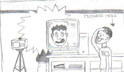
after we chose the concept for our cartoon we were asked to try different compositions for it and develop the characters a bit more. i tried to change the character to a girl and change the expressions on the faces to make it more funny. i like the one where the worker is laughing at the face. it still needs a lot of work but i think it makes it more obvious what is happening in the cartoon. i want to make the worker more exaggerated and maybe have him pointing at the screen to make it even more obvious about what is going on. i think i'm on the right track...hopefully.

cartoon


another thing we have going on in illustration class is the creation of a cartoon dealing with an issue at the dmv. the worst thing about going to the dmv is getting your picture taken because i'm not very photogenic. i thought it would be funny to address that issue. i decided to have someone getting their picture taken and have their face covered with the flash and then you see the final result of the picture on the computer screen. On the screen you see him with a funny expression. i am not quite sure the expression is exaggerated enough right now, so that is one thing i am continuing to work on.

memory portrait illustration


i haven't blogged in quite a while so this is going to be the first in many new blogs. the memory portrait illustration is just one of the things going on in class right now. we had to draw a person from memory and now we are working on the final portrait. we were asked to do three different color variations and choose the best one. i chose the one above because my mom's favorite color is green and i like the mixture of the line art with the gouache. of course i will need to make the line work a bit more prominent and add a lot more, but this was just supposed to be the basic gist of what i wanted to do. the final is due tomorrow and i still have a bit of work to do on it so i should probably do that. the final one will be up either tomorrow or thursday :)

Thursday, September 24, 2009

memory portrait sketches


for this assignment we have to illustrate a relative without using a picture as a reference. this is really difficult and i don't know if i quite grasped it yet. most of my sketches are of my mom and there a few attempts at my dad. let me know what you think...

Wednesday, September 23, 2009

gouache update


so i haven't blogged about any of my gouache work yet so here it is. the first gouache thing we did was a subject of our own choosing so i chose to do a sweet looking dog and some rocks and a sky. i did not finish the whole thing, but color is applied to the whole piece. i started working on the rocks with a bit more detail and i think they were starting to work. if i were to finish the whole thing it might turn out okay in my opinion.

the second thing we did was a product illustration. this didn't have to be in gouache but i did because i like it a bit more than watercolor. it allows me a little greater control when working with the paint. i decided to do a mountain dew can for the illustration because mountain dew is the greatest soda ever! the new can design pisses me off so i did an older version of it. i think it turned out nicely. i regret painting the background. i should have changed the color of it or not painted it at all. i think the lettering was the hardest part because it left less chances for mistakes.

final stress layout


so here is the final layout for the stress article. i guess it turned out okay. i don't think the pull quote is very effective because the text is very hard to read (this was stated in class). thinking back on it i guess i should have used a contrasting color in the quote and somewhere else in the layout. i think the elimination of all the yellow bars was a lot better...thank you rusty :) overall i like the simplicity of the layout, even though i played it a bit safe. in my next two layouts i'm hoping to try some new things.

Sunday, September 20, 2009

revision of stress layout


here is the second version of the stress layout. i changed the right page to a two column layout because i wanted the text to fall around the hand with the stress ball. i added some yellow bars to highlight the subheadings within the text. it still needs tweaking but i like it so far.

Thursday, September 17, 2009

type heavy layout--article about stress


this is my first go at the stress article layout. i started with the image of the hand squeezing the stress ball. not the most original picture but i like it because it would be recognizable to many age groups and i liked the fact that the ball was a smiley face...like stress is taking all the fun out of life which in my life is exactly the case. i tried to bring the color into the headline with that block of color. it kind of sucks that the color was really similar to the color used in the native american heritage month poster. i might try and change the color just to add some variety to the works i've done. i need to go in and tweek the block of copy because in this version i just layed it out to see if i could fit it all on the two pages. the second draft will be a bit cleaner.

final--native american heritage month poster


so this is the final revison on this poster. i added the drop shadow behind the quote to make it easier to read and i made the little line graphics bolder and larger to make them stand out. overall i'm pretty happy with it, even though our professor said he would make us all start over. although it may not be the greatest poster of all time, it is better than the one i started with. and i think i've learned a few things with this assignment mainly about concepts. it is much easier to create something when you have an idea behind it. trying to design something without any semblance of a plan is a not a good idea. also i've realized that i need to try new things. i think there is always the fallback of "oh this has worked before so i'll just do that again." this makes work boring and i want to be able to be a versatile designer. i'm definitely not there yet, but could be in the future.

Tuesday, September 15, 2009

5th illustration assignment--watercolor and ink

so in this assignment we had to combine watercolor and ink again. this time we had to do two different methods. for 5 of the pieces we had to start with watercolor and then add ink. for the other 5 pieces we had to start with the ink and add watercolor. i liked starting with the ink a lot better because it gave me more structure within each piece. i could start with a basic framework and then add the freeflowing elements. i'm not going to post any of the pictures because i felt like all of my illustrations were on the same level and none really stood out from the others. overall, i'm getting better in my watercolor skills but i need to keep working!

20 x 30 illustration assignment


yea so i was so sick of watercoloring landscapes and buildings i decided to paint a pic of my dwight shrute bobblehead. i like all the apects of the painting except for the face because it is too yellow. i still need to work on techniques, obviously, because i don't exactly trust myself with the medium yet. i don't know i guess i enjoyed working in the larger format better because it allowed my hand to feel a bit more free and gave me more room to experiment and make mistakes. i'm excited to move onto to gouche.

Monday, September 14, 2009

gilligan list

so i thought i would post my gilligan list since we are limited to it for some projects. this list includes 5 fonts we would want with us if were stuck on a deserted island. don't know how much type work i would be doing on a deserted island but i guess its a good thing to think about.

here is the list: garamond, myriad pro, times new roman, century gothic, and arial

3rd revision of native american poster


i didn't make many changes from my last layout. i made the photo extend further down the page. i like the way it turned out because it uses the space at the bottom of the page a bit more. i didn't want to take it all the way to the end of the page because of the bleed issue and it would also make the bottom of the poster feel really heavy. i messed around with the type a bit, but i need to put some kind of shadow or something behind the quote on the page to make it stand out as it is quite hard to read standing really far away from it. overall i like the simplicity of my layout. the image stands out and i think the concept works for what the events are.

life note: sometimes it is necessary to let people know what you really think. otherwise nothing will change for you. this is something that i need to work on. maybe i need someone to tell me what they really think of me?

Friday, September 11, 2009

revision of native american poster and tsoda poster


the revision of the native american poster went really well this time. i think i am finally finding a process that works for me. the old version of this poster featured arrowheads that descended down the page and i really like the look of them so i wanted to incorporate at least one of them into this layout. i found the image of the arrowhead and then i thought about what feelings were evoked from this object. i thought about the history of violence and war in the past of the native americans and found a quote that fit in with that. then i just played off of a central axis line and placed the extra text along that. i'm overall pretty happy with it. i'm going to attempt to make some of the changes suggested in class...like making the image of the arrowhead extend farther down the page.

the tsoda poster was a completely different story. it was virtually impossible to stay away from something cliche because you want people to recognize what kind of event it is. two of my roommates are dancers so i knew i could draw a little inspiration from them. i took pictures of tap shoes and point shoes but only decided to use the tap shoes. i started with the title and then placed three shoes around that. it turned out pretty well i guess. like i said it was really cliche, but whatever. i'm glad we decided not to go further with this one. i'm glad i get to focus on the last revision for the native american poster.

Wednesday, September 9, 2009

4th illustration assignment--watercolors and ink counterparts


this assignment was really rough because we had 20 illustrations instead of 10. granted we had a couple extra days, but i'm a procrastinator so it didn't really matter. i feel like if i take more time i might actually be good at watercolor. there are a few in this group that were semi-successful which made me happy. the ink drawings were a different story. i still need to develop observational skills in order to translate that into ink. overall i still need to work on techniques and confidence in my work.

life note: confidence is something that is lacking in all areas of my life...its definitely something i need to work on. could change a lot of things for me.

native american heritage month poster


so i guess i didn't really start out with a concept for this one so i'm thinking i might have to re-do the whole thing. i actually really like the look of the lines with the arrowheads because it draws the eye down the page but the overall ideas in the poster need to be more centralized. i think i know where i want to go with it....its just a matter of doing it. any thoughts on this one would be great though!

Saturday, September 5, 2009

3rd illustration assignment--architecture


yea so i guess my illustration skills are getting better. i feel like i'm getting more comfortable with watercolor. i'm usually a control freak so its been keeping from really letting go with the water colors. while the buildings in this assignment are not necessarily detailed in any way, i feel like they are somewhat successful. i definitely still need to work with the stuff more.

Friday, September 4, 2009

re-do of latin dance party and truman rock climbing club posters


yea so i'm about to make this post very late on a friday night...awesome. obviously i have the most fun life ever! so this third poster assignment was about the same as the last one in my opinion. i'm still having problems with the "extra" type in the layouts. i feel like i have a semi-good grasp of the headlines, although i still need to work on placement of some the words. i kind of lose interest in the poster after i make the headline/graphic and just place the the "extra" type semi-randomly. its one of my weak points. the mountain climbing poster was just okay. i wanted to make it look like a mountain range dissolving in the "tools" that mountain climbers use. i don't think the two styles of graphics really matched, and that was pointed out in class. i think i was kind of going in the right direction though. with the other poster, it was hard to get away from cliches. i actually didn't get away from them at all. i went straight for the picture of the two people in a dancing position. awesome...i wanted to make the subject of the poster recognizable, but i don't think i tried enough options to make anything worth looking at. obviously i wish i could re-do this poster. looking at other peoples stuff in class has actually inspired me a bit. i realize there are other techniques that i am not effectively utilizing. it will take me a while to get out of my comfort zone but i think it will eventually happen.

life note: its really sad when a group of friends can't think of doing anything fun on a friday night. we need to be a bit more creative.

Wednesday, September 2, 2009

2nd illustration assignment--landscapes


my first illustration assignment was really horrible. i have never worked with watercolors before so i'm really unsure of myself when i work with the medium. the landscape assignment was a bit more successful. i still need to work on making clouds. the video today...which is hilarious by the way...gave me some good pointers on making clouds. i hate to admit that i was using the technique that he said not to do. embarrassing i know. i feel like this landscape was my most successful out of the ten. the sky isn't horrible; you can kind of see my attempt at making clouds. the ground has some good points as well and the trees are my favorite part. i think i'm getting comfortable with making the leafy parts of trees, but i still need help with the tree trunks. overall, for having only been my second time working with watercolors, i feel like i can get the hang of them with a lot (and i mean a lot) of practice. i'm nervous about the architecture project because there are less places to make mistakes. i just need to try and be less of a control freak!

re-do of german culture event and ceramics posters


i feel like this second assignment was a little more successful for me. i wish my clay graphic could have been a little more tight but overall i felt my concept for the ceramics poster was pretty good. i wanted to keep the idea very simple because i wanted it to appeal to all age groups. with the german culture poster i wanted there to be a clear german feel. i know when i think about germany i immediately gravitate towards bratwurst. my family is of german descent and my father is a meatcutter so bratwurst is very important to him. rather than make a joke about the brat i wanted to push the idea of "linking" with another culture for one night. i think the poster was mostly successful. the graphic might have divided the space a little too much but i feel like it serves the purpose of grabbing a lot of attention. i still think i have a lot to work on with the blocks of text. i'm pretty comfortable with headlines for the posters (at least i feel like i am) but arranging the other information is still giving me a headache. overall, the time restraints are still the biggest difficulty for me. with my other classwork it is hard for me to dedicate a whole lot of time to these projects and still get some sleep. i'm excited about the 11x17 posters for friday. i'm excited to see how i will work with a larger space and what it will look like when it is actually printed out. we'll see what will happen.

life note: school is making my life a social disaster. i love watching my friends hanging out and going out while i am pretty much glued to my computer, to my desk, or to my paints.